CONT Importação
Your bridge to global success

Identity for an import company connecting Brazilian businesses to the Chinese market — containers in perspective, portals opening.
Full branding
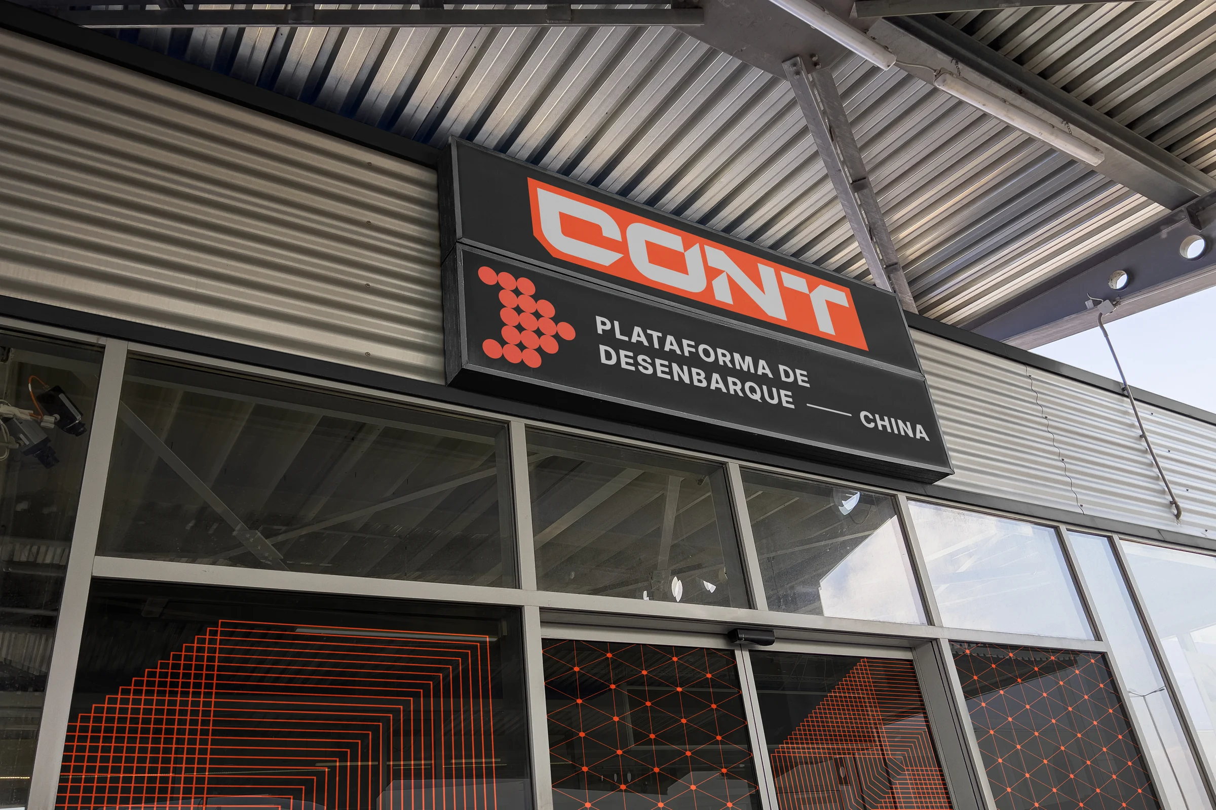
About the brand
CONT connects Brazilian companies to the Chinese market, simplifying what many see as a bureaucratic maze. The visual identity turns that complexity into something intuitive and magnetic.
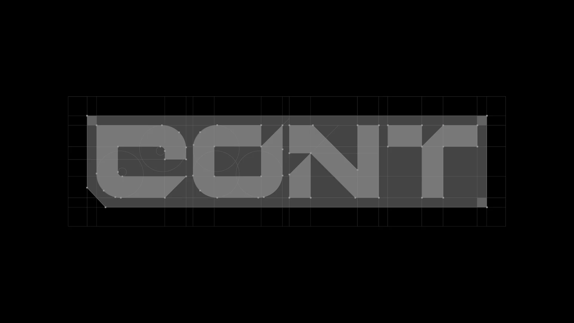
The concept comes from shipping containers seen in perspective — that exact moment between closed and open, uncertainty and discovery. The 45° angles at the logo's terminals are not merely aesthetic: they symbolize portals opening, creating a feeling of perpetual motion.
Logotype construction


Paint the world
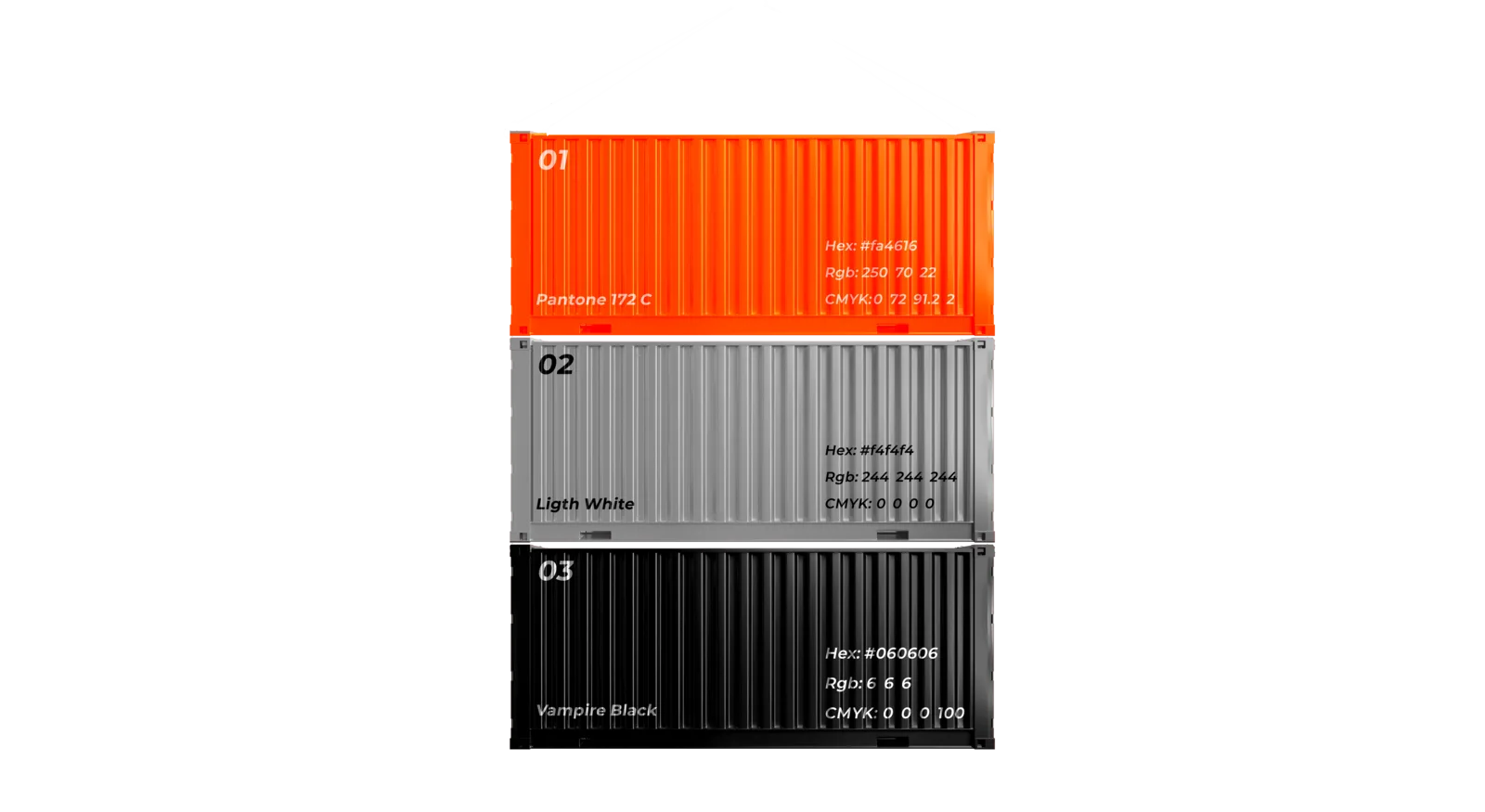
Orange works as the perfect balance point between the intensity of red and the clarity of yellow — mirroring how CONT balances efficiency with transparency. It occupies a unique space in the visual spectrum: unusual enough to capture attention, yet universally read as approachable and dynamic.
Design the dialogue
Typography plays a crucial role through Inter — a family that embodies the perfect balance between corporate reliability and contemporary accessibility. Clean lines and optimized legibility work across digital interfaces and physical environments, while subtle geometric qualities echo the containers throughout the system.
The brand in the world

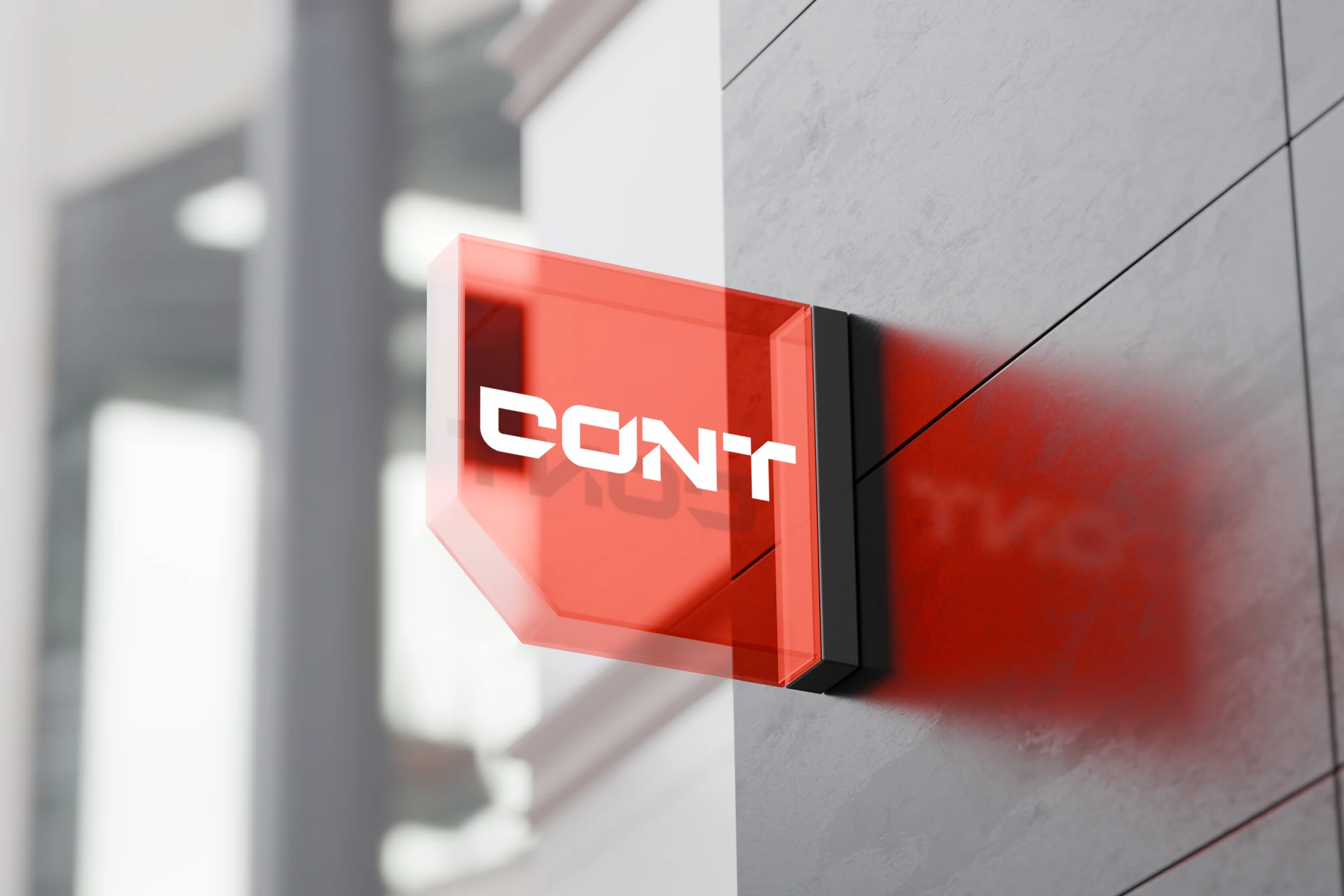
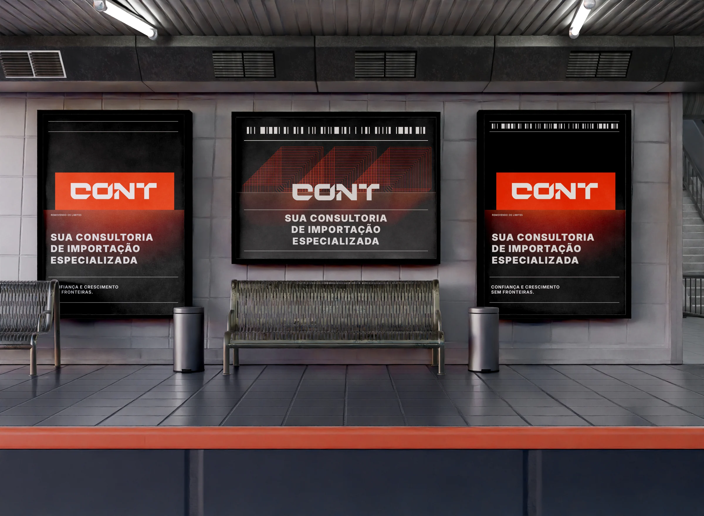
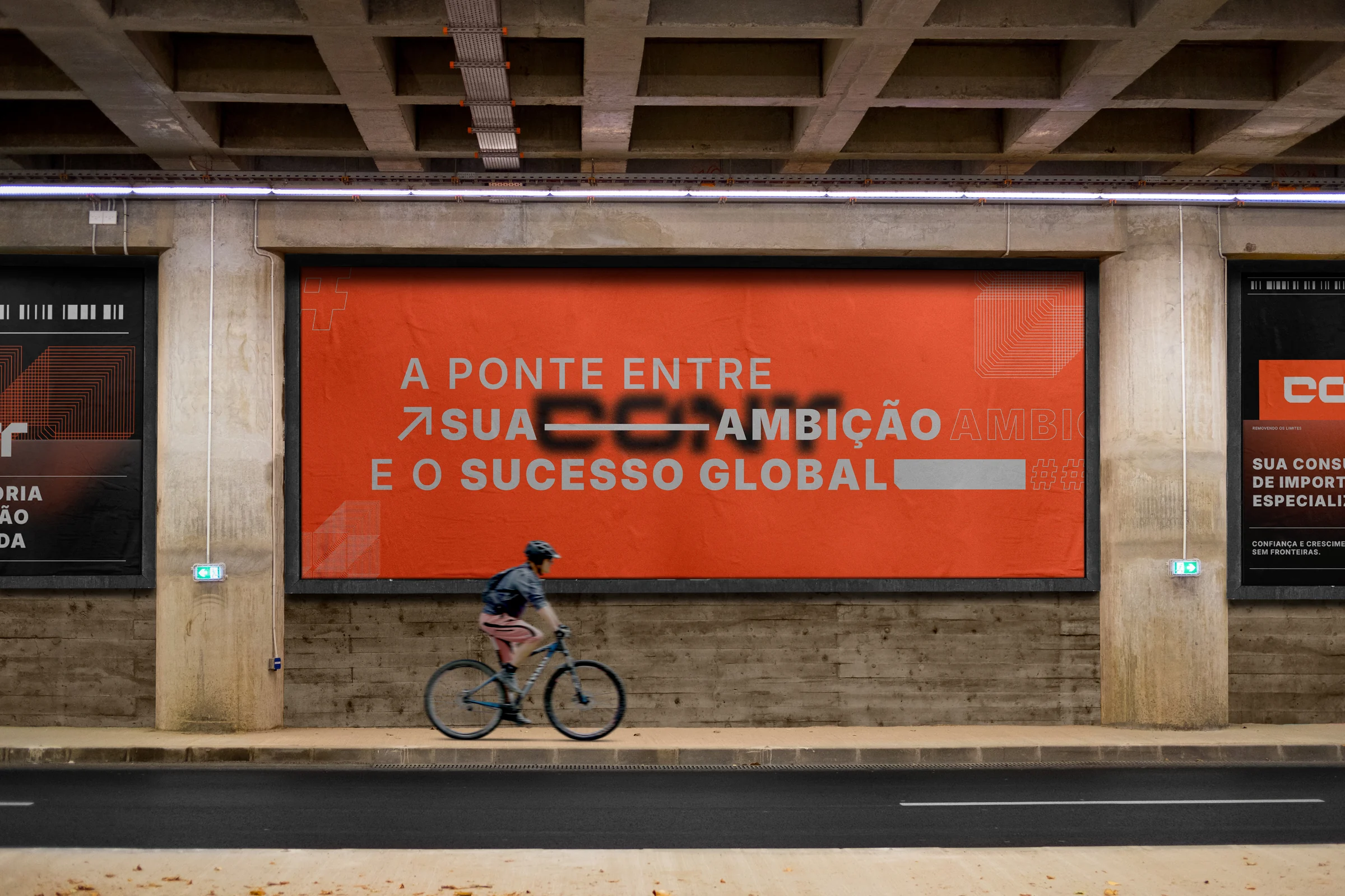
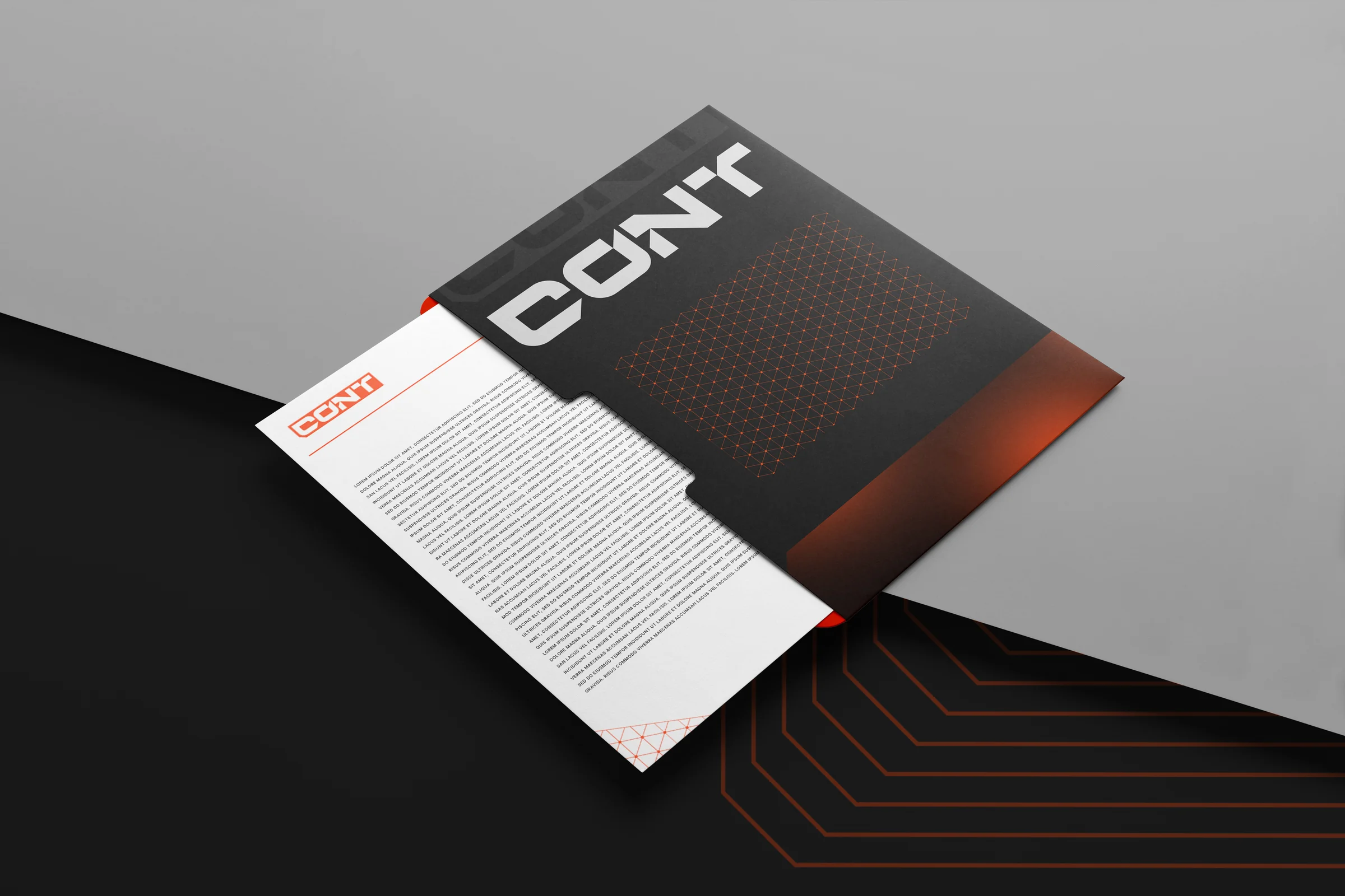
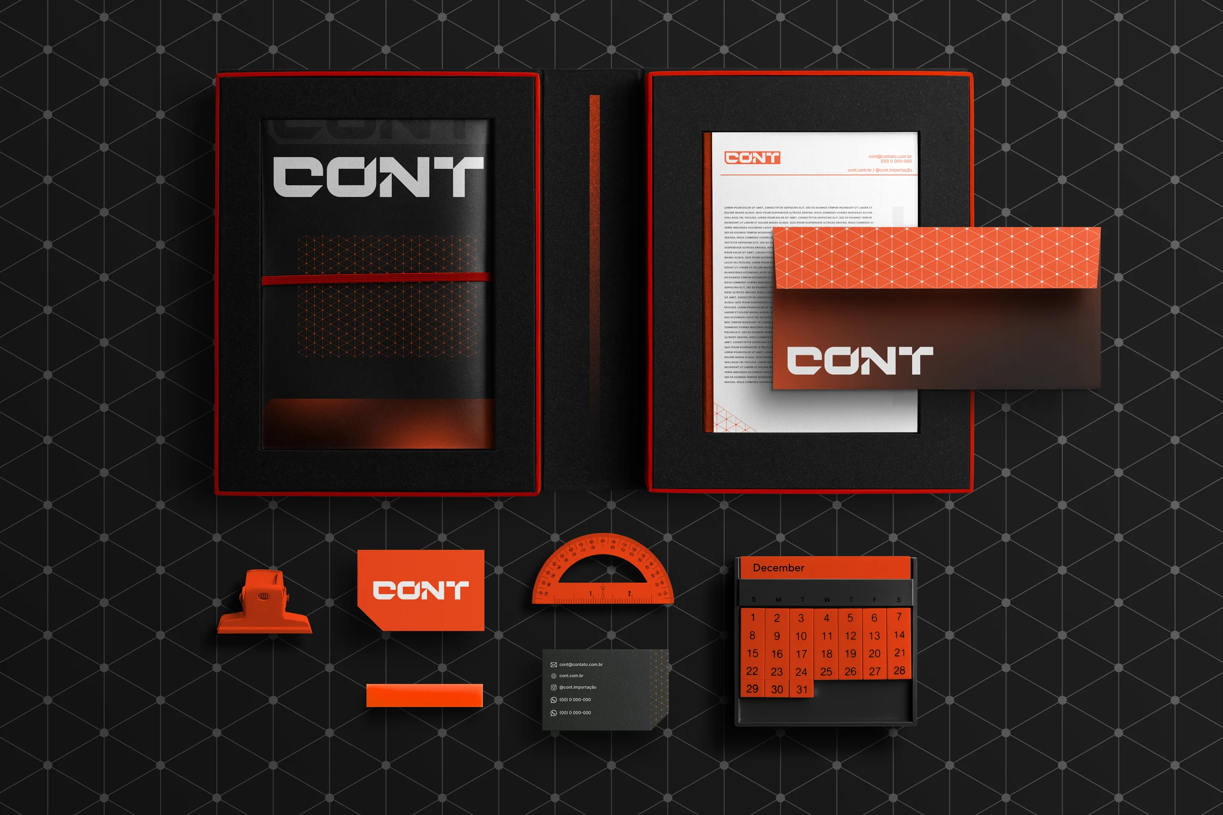
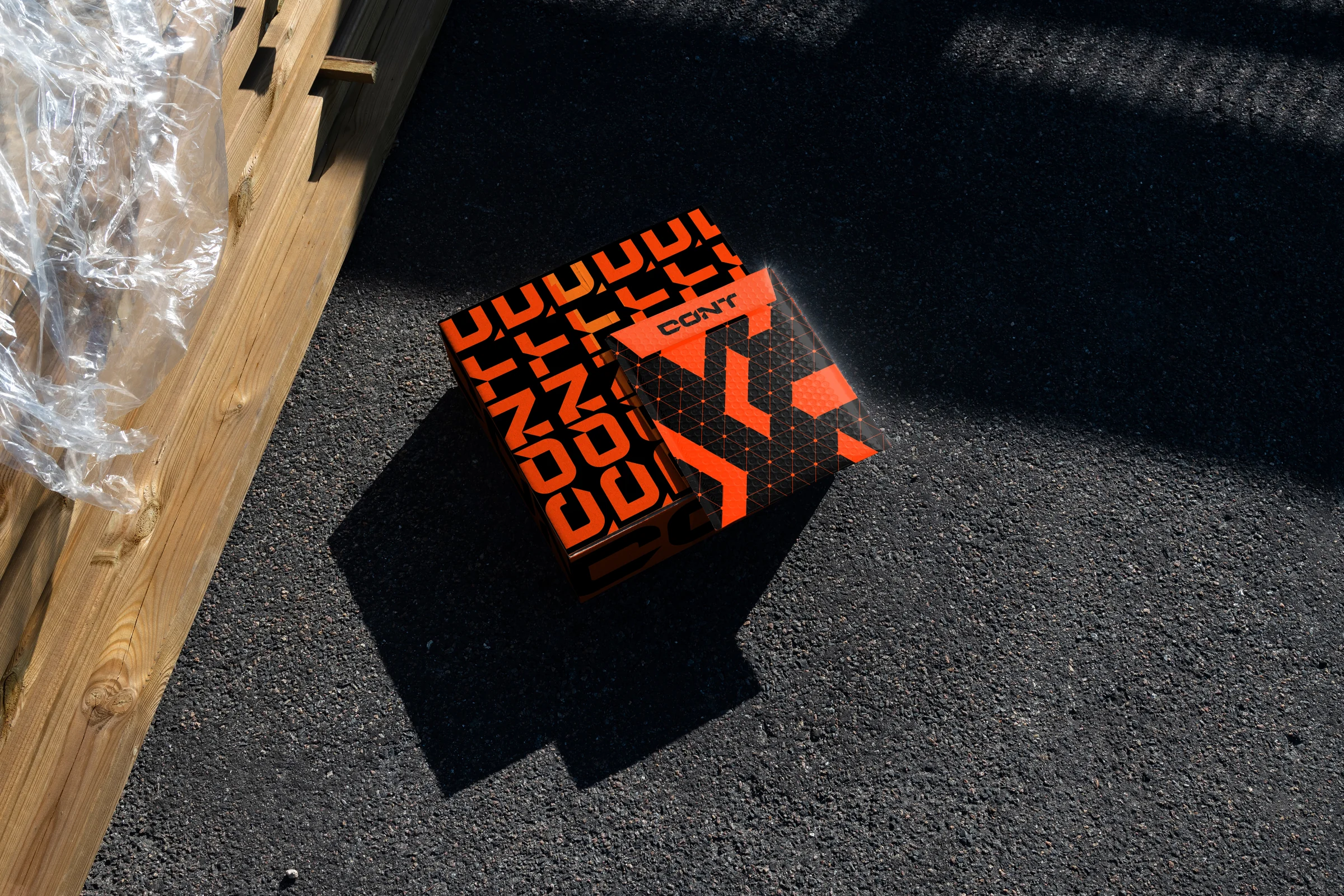
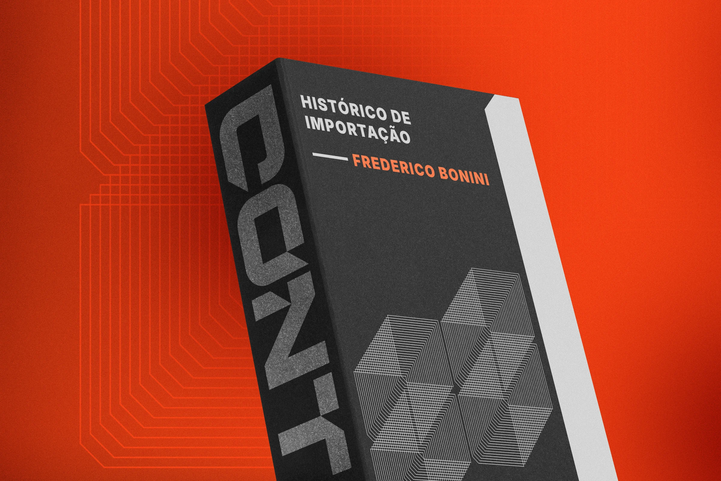
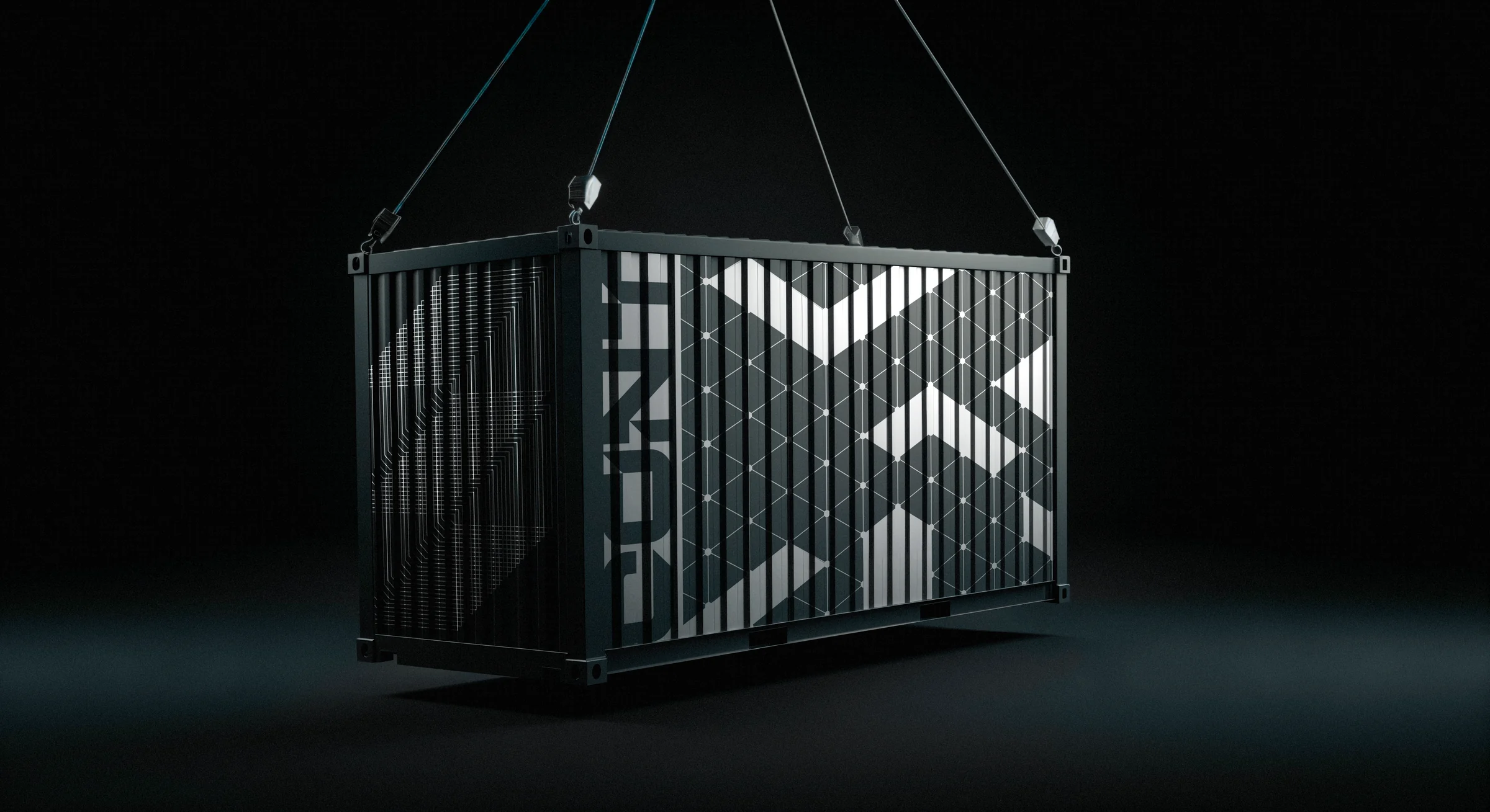
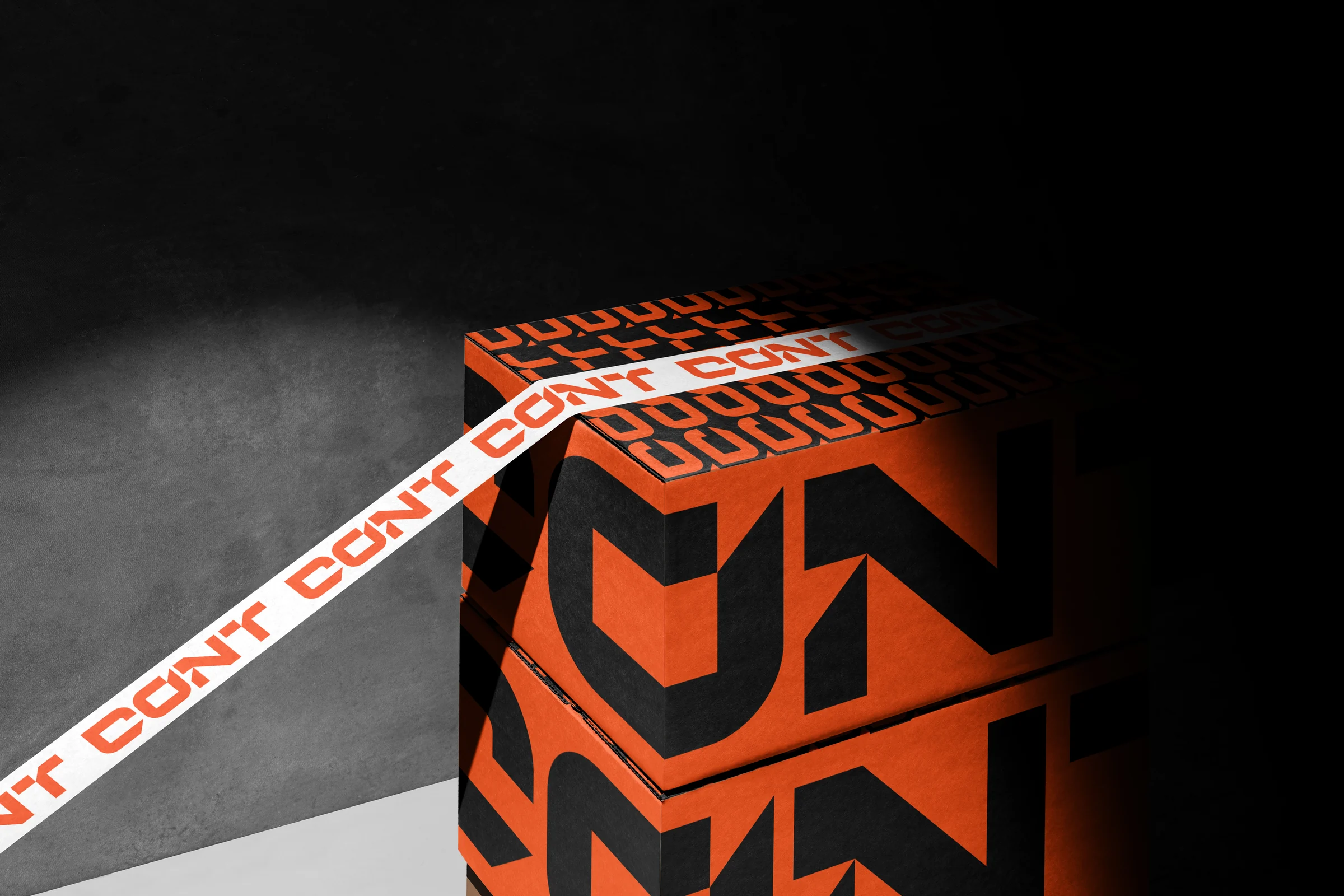
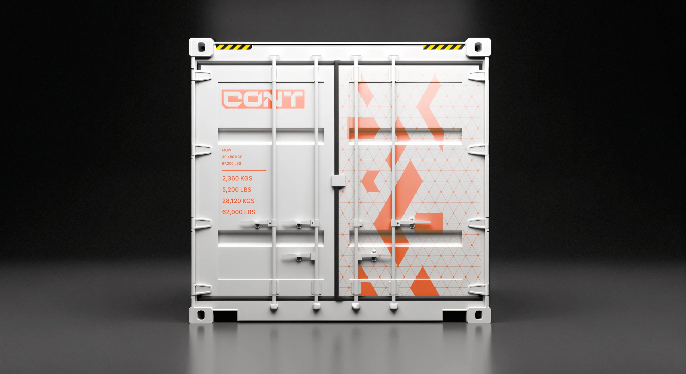
The brand patterns play with that same visual language — shapes revealing layers of meaning as viewers interact. The resulting identity turns the complexity of international trade into a confident, engaging visual experience: making global commerce accessible without oversimplifying its sophistication.