eletropolo
Electrifying your dreams

Redesign of a brand with nearly 30 years in electrical supplies — two poles united by a lightning bolt.
Brand redesign
About the brand
eletropolo carries almost 30 years of history in electrical supplies, lighting and construction. Strategically present in Campina Grande and Joao Pessoa, it is a reference in technical and decorative solutions.
The redesign faced the challenge of preserving market recognition while updating the brand to contemporary standards. The new identity abandons the former rigidity in favor of elements that communicate approachability and flow. The logo's central concept — two poles united by a lightning bolt — materializes the value proposition: being the connection between technical projects and personal achievements, between function and aesthetics.
Logotype versions

Paint the world
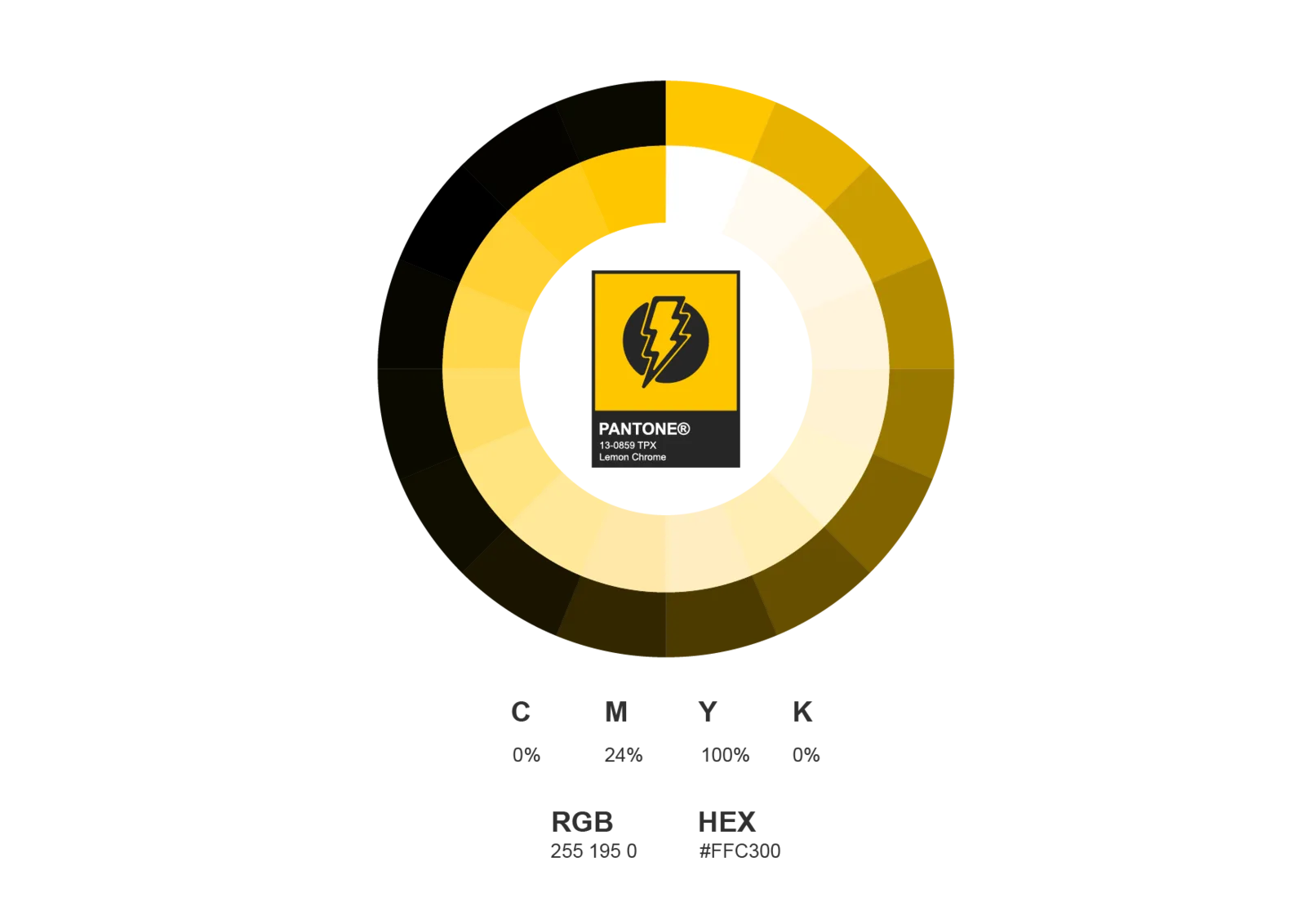
The redesign kept the essence of the original palette, applying Pantone standardization for consistency across every interface. The update created a subtle balance between the familiarity needed for recognition and the contemporaneity the market demands. The palette works in technical applications and aspirational contexts alike — reflecting the duality of the business itself.
Design the dialogue
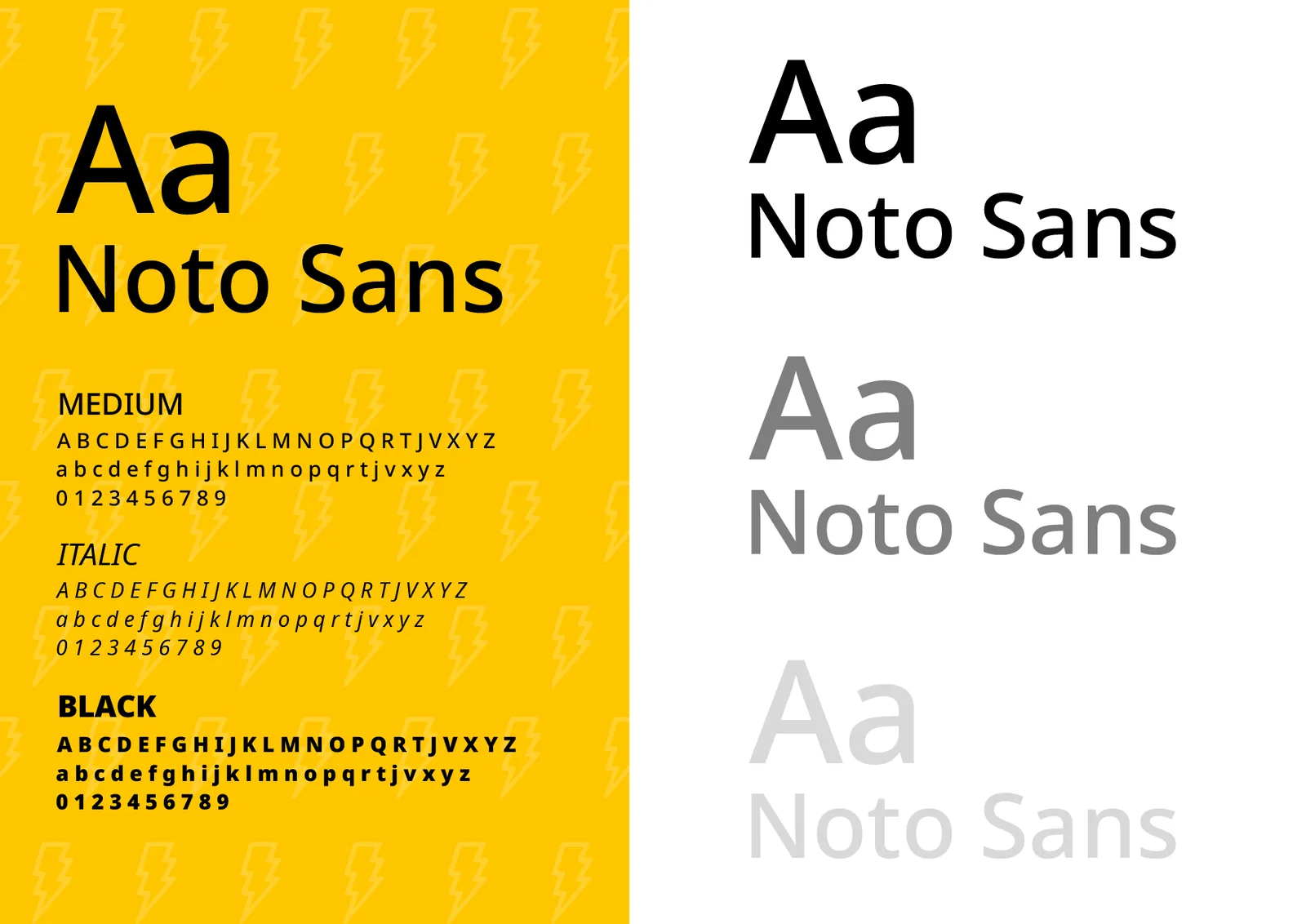
The shift to lowercase in the logotype broke the former formality, creating closer, more approachable communication. Noto Sans as the corporate typeface brought technical functionality combined with personality: delicate curves and robust terminals reflect the brand's value proposition, with flexible hierarchy at every touchpoint.
The brand in the world
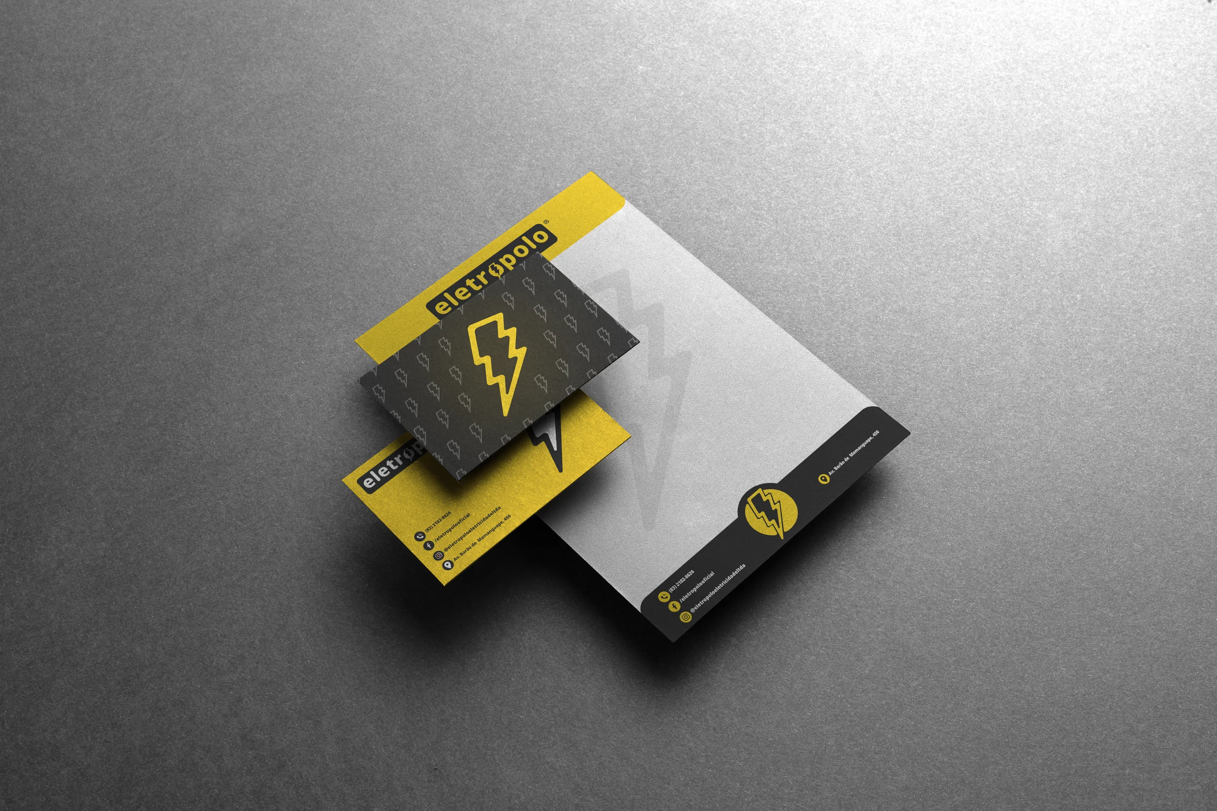
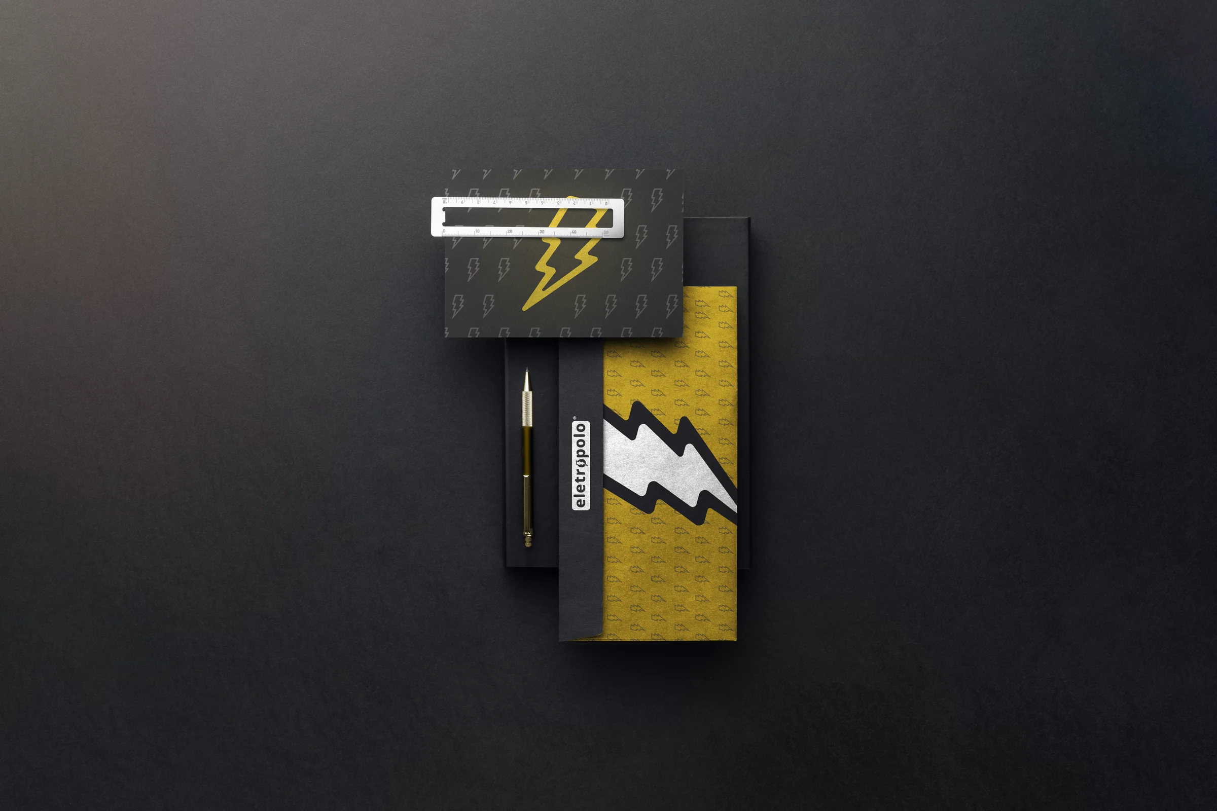
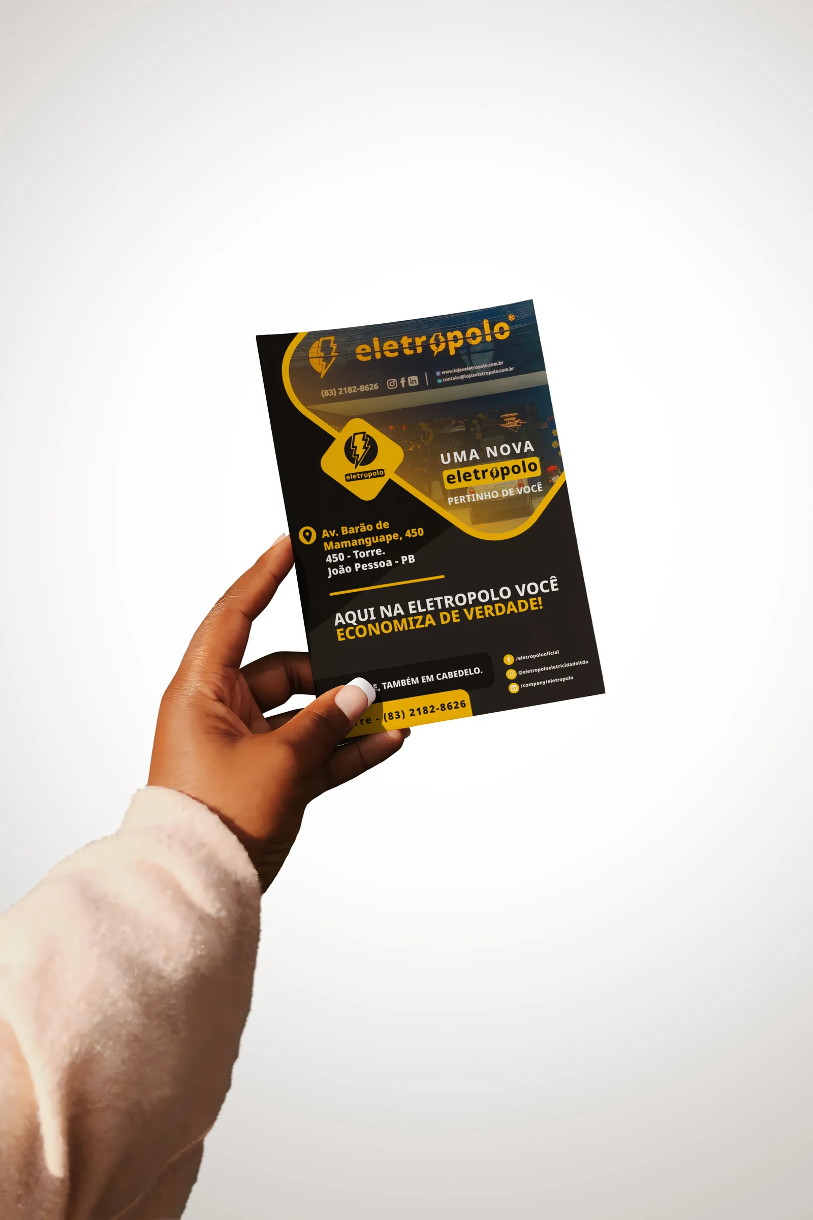

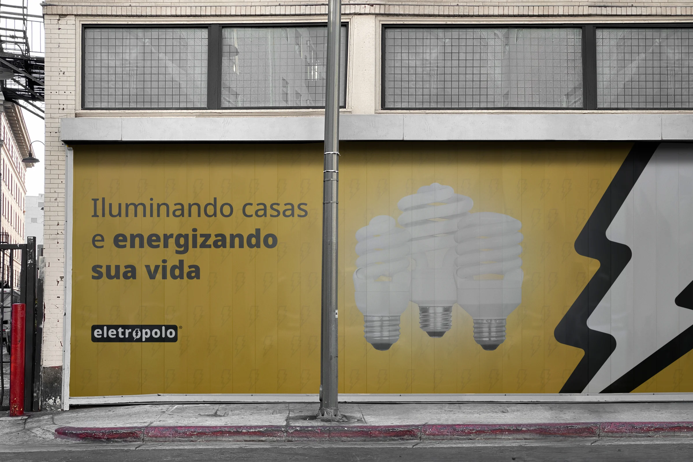
Lighting homes and energizing your life.
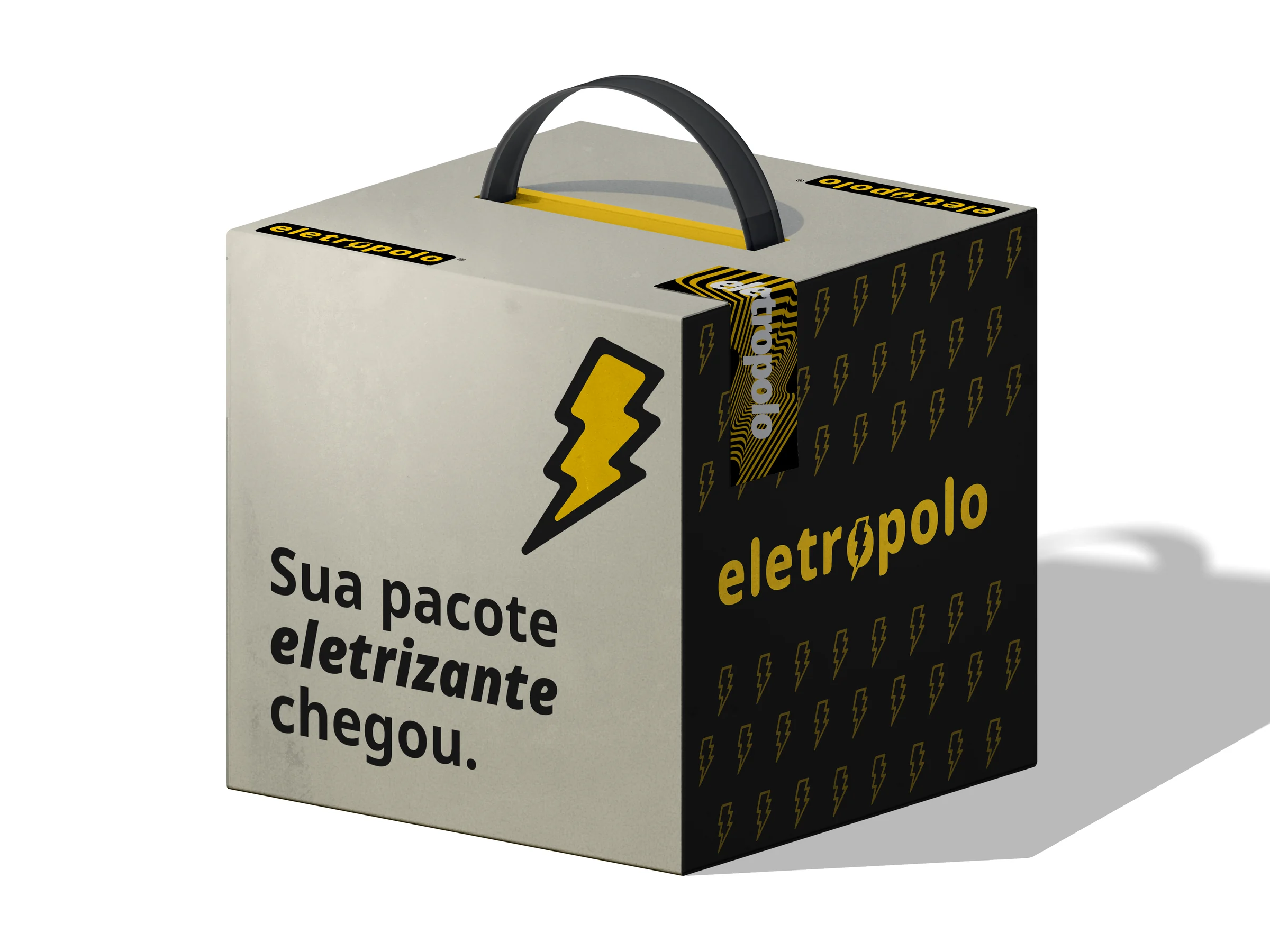
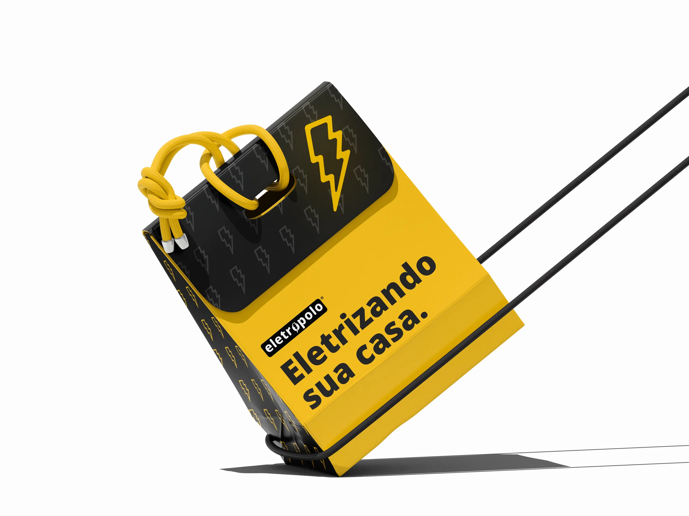
The project transcended a simple aesthetic refresh: every decision answered a strategic goal, weighing a three-decade legacy against contemporary consumer demands. The result connects the brand to its past while projecting it into a future where user experience and effortless connection are fundamental — a complete visual system that electrifies dreams.